
The art of wine labels is a pretty interesting subject. When Scott Huntington proposed he write about this subject, I was pretty excited. The fact is I had been doing some research on the subject and thought who better to write on the subject then Scott who has been involved in designing wine labels.
Scott is a writer, blogger, and wine enthusiast. He lives in Pennsylvania and with his wife and son. His blog is a collection of writings about a wide variety of things he finds interesting. So without further ado here’s Scott and what he has to say about the art of wine labels.
Art of Wine Labels
It’s popular for chefs to learn that the person or people they are serving will eat their meal first with their eyes, second with their nose and third with their mouth. If this concept applies to the very food you eat, it’s no surprise to find that marketing consultants everywhere like to apply a similar concept to your drinks or, more specifically, to your wine.
 Choosing a bottle of wine is easy for some. They find one they like and they stick to it. However, if you’re a new wine connoisseur, or if you simply want to try something different, the company has to convince you to buy. After all, everyone has a different palate and while you may favor sweet whites, your friend may love the dry reds. How do you decide which red to buy for the evening when you don’t know much about them? Some decide by the label.
What Wine Labels Mean
The art of wine labels convey many things to us. They tell us if the wine is cheap or expensive, classy or trashy, sexy or, well, not sexy. Strangely, the label on the bottle has more power than simply getting us to the cash register. The wine label can actually cause us to enjoy the wine more. Adding rich texture or an expensive looking border around the wine label tricks our minds into thinking that this $12 bottle of wine is worth much more. As a result, we think we’re drinking expensive wine without the buyer’s remorse.
Telling the Difference
It’s usually pretty easy to tell the difference at your local store. The more lavish bottles have a type of design that stands for “expensive” and the less expensive wines are going to look cheaper. A heavy cardstock label with minimal design and a gold top? That’s an expensive wine. A bottle with a cartoon mermaid on it? That’s probably not as expensive. A bit of gold or silver leaf added to the label makes our subconscious think that the wine is much more expensive than it may actually be. Even the distinction between a screw-off top and a cork can make a difference in how you look at the wine.
The color of the label can also have a drastic effect on how you view your wine choice. Choosing colors that reinforce the flavors inside the bottle give the drinker a higher rate of satisfaction, since seeing the colors first makes our brains taste those flavors more. Try pouring your favorite red into a green and yellow labeled white wine bottle, and give some to your friends. They may actually taste more citrus than usual, simply because of the bottle it came from.
 The Fine Print
When I became a graphic designer at a winery, I was excited at the chance to create wine labels and couldn’t wait to get to work. However, I quickly realized that there are all sorts of rules and regulations that go into a label. One Christmas I was working on a custom wine label for CJ Pony Parts, a mustang parts retailer. Since mustangs are classic American cars, I wanted to have an American flag in the background and the car in front. To my surprise, I found out that this would have been illegal. The American flag is not allowed to be on a bottle of wine, because you’re not allowed to try and show that the government is endorsing it. It seems silly, but I had to come up with a new design anyway.
Another quirk, and royal pain for a designer, is the wording. We had a blend of cherry and Cabernet, and named the wine “Cherry Masquerade.” Upon submitting the label for approval through ATF (a very long and complicated process in itself) we learned that we were not allowed to use the word “Cherry” in the name of the wine unless there was more than 90% cherries in the wine. Ours happened to be 60% cherry and 40% can, so we had to come up with a new name and submit again. There are also rules about font sizes/colors for alcohol content/government warnings, and rules about where they have to be on the bottle. When you start getting into 2-part labels that have a front and back, it gets even more confusing. Following all the rules and still creating a nice-looking label can be quite a challenge.
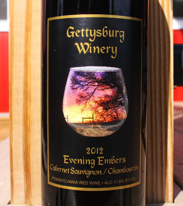
So, the next time you go shopping for a bottle of wine, keep this information in mind, and think about what kind of work went into that label. See what differences you can spot while comparing the $10 bottle to the $20. If you really love the bottle before you try it, you’re more likely to love the wine. Oh, and if you’re curious, the photographs of the wine bottle are some labels I designed for the 150th Anniversary of the Battle of Gettysburg. Notice: there’s no flags.

 Wasn’t that great? I find the art of wine labels to be pretty fascinating. It’s really fun to learn more about the in’s and out’s of the art of wine labels and all their nuances. So the next time you see a wine label that catches your eye, you’ll have a better understanding of what it took to make that happen.
When time permits take a moment to find and follow Scott at @SMHuntington or check out his blog.
Time for a glass…
If you enjoyed reading about the Art of Wine Labels, check out Taking The Mystery Out Of Wine Tasting, Wine and Cheese Pairings: The Perfect Pairs and Basic Wine Terms and Definitions.